Every few years, the Imperium evaluates the efficacy of Highsec ganking. Fortunately, we passed our audit, and The Mittani has once again acknowledged the People’s Democratic Republic of Highsec. Consequently, the ice interdiction will continue, until further notice. Meanwhile, in honour of our continued status as an independent sovereign state, I have graciously allowed CCP to use my personal seal.
I’m sure James would have loved it.
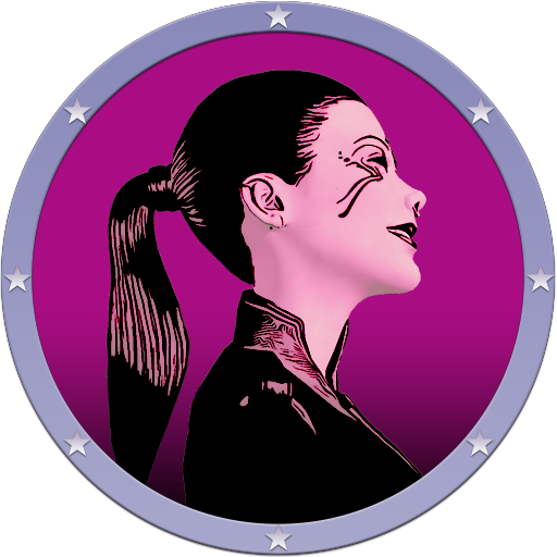
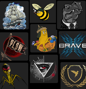
This design was produced by Zaenis Desef, and is reminiscent of similar designs by Blake McAllister and Sargon of Amerish.
Sargon’s version, some felt, was a little too good.
Blake’s idea was really the same basic concept. Zaenis and I looked at this, and discussed how we might improve it. Credit where it’s due, I never would have come up with the idea of putting myself on the alliance logo. Such hubris and vanity is far beyond me. I was perfectly happy to have James enshrined forever, in a hideous shade of orange. However, some people think it’s high time to shatter the glass ceiling, and put a woman atop our keepstar. Well, I can’t disagree, I should have called the alliance AIKO. However, I gotta say, Safety. will look pretty good on the nullsec map.
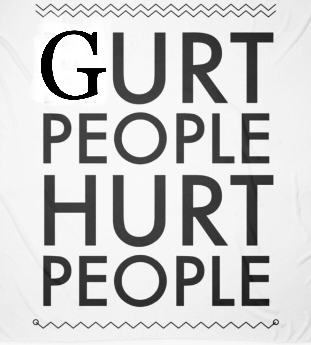
There were a number of suggestions, some that just didn’t quite match CCP’s formatting requirements. Gurt Benoit, for example, had a great idea. It was just a little ahead of it’s time. Once CCP fixes Walking in Stations, we will surely be able to permanently trap miners inside decorative bubbles.
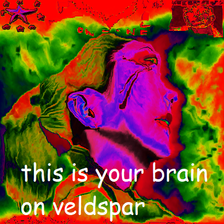
I liked the message here, but it’s too wordy.
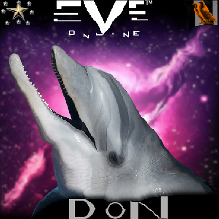
Dolphin Don wanted a sea theme, but it was too sexual.
Don felt we could use the logo to educate, about the dangers of mining, but we were concerned this might trigger recovering miners to relapse.

Tweeps wanted more of an early 1990s broadcast television theme, but personally I prefer pictures of myself. Can you blame me?
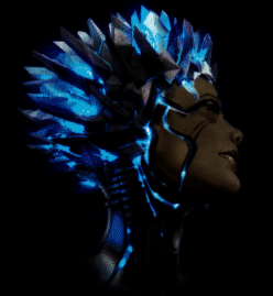
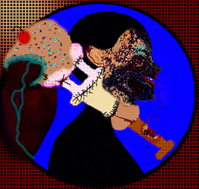
Before he was banned, Zuzzik portrayed me as a crystalline entity.
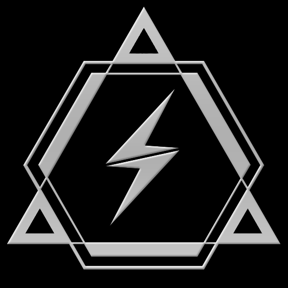
I thought the triangle S thing was cool (who made that?).
![]()
Globby suggested using the criminal timer.
Some submissions were good, but they weren’t the right size.
Ultimately, there were a lot of fine submissions.
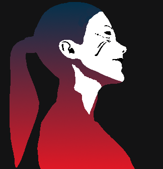
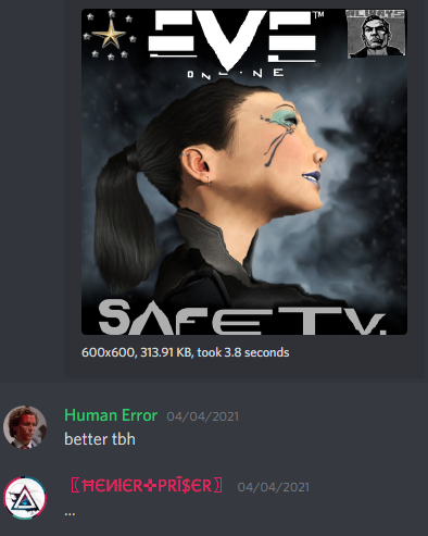
Alt 00 had an interesting idea, which we could have developed further. However, Zaenis was the first to produce something with sparkly stars. Oh, how cute! 100% of the voters immediately selected his design. Subsequently, in their infinite wisdom, CCP decided to attack my fair visage with an eraser.

Why?

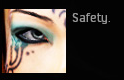
At first, I thought CCP was sending a warning. They didn’t do this to anyone else. No other logo has been so ravaged.
Why am I singled out for defacement, covered in dirty grime and scratches? Well, I know the reason. More than any alliance, we represent the gritty reality of New Eden. CCP has chosen us to represent their vision. Miners will never live to see the freshly painted logo. All carebears will ever see is how it looks later, when the greedy salvager scoops scrap metal into his hull, wondering who killed his friends… and why? So that’s fine CCP, if you want to scuff up my face, I’m gonna scuff up your crabs.

Regardless, people seem happy with it, not that they have a choice.

If you think it’s so amazing, join my alliance.
Together, we can save the miners!